Eunova, A Crime Fighting Tool in 2050
Design Brief
We were tasked to imagine and explore a world where our insight* have come true. Then concept, develop, and fabricate an artefact that belongs in this future world that does not yet exist.
*With the increasing amount of artificial intelligence getting involved in the crime scene investigation, it is expected to expand. However, its risks are just as great as its benefits.
Eunova is a pair of crime-fighting contact lenses which provides insight and information when detectives investigate at a crime scene. Through the utilization of augmented reality (AR), data is exhibited effortlessly.
Eunova records everything the user visually perceives, scans objects in where the incident takes place, calculates its area to uncover physical evidence such as hair, fibre, glass, etc. All recorded footage are stored confidentially, allowing users to replay and recollect details regarding each case.
To minimise the risk of data leakage, Eunova is not open to the public. It is merely accessible for police who work at criminal investigation departments and licensed detectives around the world.
All users are required to register their DNA in Eunova’s system when initializing it. Its DNA recognition would scan users' ocular cells to substantiate their identities. However, if the scan fails, Eunova would turn back to a pair of normal contacts, and all users will receive the warning signal its AI assistance sent including the precise location of where the attempt was made.
Eunova has revolutionized the field of crime scene investigation with its precise analysis and discerning examinations. Its assistance not only enhanced the efficiency of homicide-solving, but the crime rate also went down on a global scale.
Eunova is a life-changing invention and it is continuing to bring truth to the table.
View Artefacts :
1. Lenses Poster - Figure 1
2. Industrial Poster - Figure 2
3. Interface Poster - Figure 3

Figure 1

Figure 2

Figure 3
DESIGN PROCESS
Week 1 - Concept
Task 1: People, Places, and Things
Look at our insight and brainstorm the people places & things surrounding it

Task 2 : System Mapping
Using our list of People, Places, and Things visualise the greater system around our insight and its surroundings.


Task 3 : Brainstorm 12+ Artefact Ideas


Task 4 : Select three artifacts that you would be interested in to create

Task 5 : Mood Boards and Narrow down
[ Smart Contact Lenses ]
Instead of purchasing contact lenses and "decorate" them, I would create posters which are similar to what I previously made for DES 243 (Design And Assistive Technologies), and design its look and feel in a 2D form.
( I named the lenses, Enqueter, in my previous assignment because Enquêter stands for "To Investigate" in French )


[ AI App ]
Use Adobe XD to create an user interface which demonstrates how my smart lenses would assist detectives for crime scene investigation.

[ Compact Cameras ]
Wearable cameras that detectives would use to record crime scenes with less effort.

( Despite this was one of my artifact interests, I was certain that I would not be creating this. Not because of my in-develop rendering skills, but because this artifact would have more limitations in terms of what I can explore. )
At this point, I only had a vague picture of what my final artifacts might look like, but the deeper I dived into my insight, the more vivid the picture become.
Week 2 - Develop
When the second week starts, I set up 5 values for my future artefacts so I can keep my designs consistent.
Refined
Minimalistic
Futuristic
Professional
Innovative
At the mean time, we had a project update.
We could submit either
1 physical artifact — or — 3 images describing our artifact
I chose the latter.
Hence I started to brainstorm and piece together more specific mood boards on Pinterest and Behance.


Key elements:
Colours - bright teal, bright magenta, bright cerulean, arctic, white, different shades of gray and black
Visual - rounder edges

Key elements:
Colours - bright teal, bright cerulean, arctic, white, different shades of gray
Visual - layered circles, circles with dashed strokes, polygons, column graphs, data


Key elements:
Colours - mixed-gray, dark cerulean, black, white, cargo
Visual - ellipse, triangle, rectangular

Key elements:
Colours - bright canary, shades of gray, sepia, light pigeon
Visual - rectangular, rounded rectangular

Key elements:
Colours - dim canary, bright cerulean, dark space blue, shades of gray, black
Visual - flow, rhythm, proportions, emphasis, hierarchy, contrast, balance, proximity

Time to Experiment + Sketch!
[ Rough Prototype of the Packaging ]


[ Ideation Sketches of the Posters ]


After the ideation process, I decided to abandon the name - Enqueter, and designed a more futuristic name for my lenses - Eunova.
I also narrowed down my artifacts to:
1 industrial poster
( which has the "professional" look of the lenses )
1 lenses poster
( a male model wearing the lenses - most detectives are male )
1 interface poster
( demonstrates the display )
Week 3 - Less Is More
"Be wary of overreaching. Limit your scope and add contingency. Aim for a single world-class detail over multiple amateur ones." ( Hans Kim, Lecture Slides, 2020 )
Inspired by the Beats Posters, I started my creation journey for the industrial poster using Adobe Illustrator. In order to bring quality of life, it is essential to keep my design simple - less is more. In addition, viewers could easily center their focus at a glance.
HOWEVER, THIS WAS THE LONGEST PROCESS EVER !

After watching several tutorials on Youtube, I managed to blend the thin lines into a shape while experimenting the gradient / lighting of the background.


A Slight Turn:
After presenting my progress to one of my lecturers, Krishna, he suggested me to change the present mode from Landscape to Portrait. He also encouraged me to look at the poster designs of some
male-orientated products, such as Johnny Walker ( Note: drinking is injurious to health )


I observed the relationship between the text and the blank space, the relationship between objects ( their positioning, use of contrast and balance ), then I applied my observations and the design principles I learned from Design 101 ( Why We Design ) into the portrait version of my industrial poster by using guides to navigate my composition into rule of thirds.

Week 4 - Reverse Engineering
[ 4 Step system for reverse engineering - Hans Kim, Lecture Slides, 2020 ]
1. Observe
Find work that you want to learn from and identify elements you want to study
2. Disassemble & recreate
Breakdown the chosen elements to fundamental components to understand processes and techniques
3. Play
Spend time playing with the found components, following your intuition to discover new experiments and possibilities
4. Apply
Use your new gained knowledge and skills to a new context
I began to design the lenses poster, but after seeking advice from Hans and Krishna, they both suggested me to change the picture from figure 1 ( which was a work-in-progress ) to figure 2 because figure 1 feels more commercialised whereas figure 2 has a consistent color-scheme with the industrial poster - black and white and it is more eye-catching.


Figure 1 Figure 2
To quickly adapt to this change, I gathered some inspirations to design the layout. Then I once again observed the relationship between the title, text and objects, ( the space between the alphabets, and the use of space as a whole - Contrast, Balance, Proximity, Rhythm, Proportion, Emphasis and Hierarchy ). Reverse engineering was also put into practice by experimenting through different typographies, and compositions.
( The orange arrow lines were marks which were made as a reminder for myself to locate the details. )

To find the fitting typography, I created another mood board ( using Behance ) for inspirations. I also tried mimicking them on a piece of paper.


Figures below demonstrate my persistent experiments trying out different typographies, scales of space and lighting.
Despite these adjustments may seem subtle, it is my believe that details are key.


Week 5 - Iterations


Before combining them with the descriptions, I decided to leave the industrial poster and the lenses poster on my desk top for next week's fabrication and start gathering images and inspirations for the last poster - Eunova's interface.
I was going design with figure 1, but the quality of the image was not high enough, so I started with figure 2 instead.


Ever since Krishna introduced me to G Munk who is a multi-talented director, photographer and designer, he became my biggest source of inspiration. Below are the interface he designed for the movies: Tron Legacy and Oblivion which I refer to in my design process.


Week 6 - Fabricate
I finalised the industrial poster and the lenses poster, but I encountered some obstacles in the process of designing the interface poster - I was not happy with the image anymore and I felt lack of inspiration hence I decided to change EVERYTHING.

After a deep dig, I found 2 potential replacements for the background image and figure 2 was the chosen one.


I also restored my motivation and inspiration source by browsing through the futuristic user interface designs below.


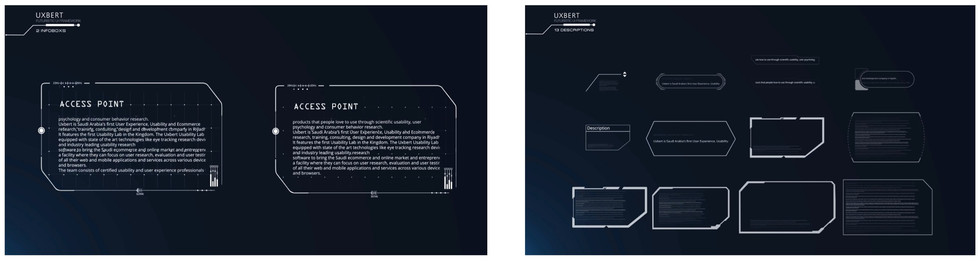
This stimulation accelerated my process and even enhanced both the efficiency and quality of my work.
I then drew inspirations from some of the components above and customized them into my own.

Reflection
Over the spam of eight months, I am amazed by how much I have grown as a designer and a human being. I became more sympathetic, more persistent, more innovative, and I also became more cautious about sustainability.
I learned that design is so much more than just aesthetic.
Design is a journey.
Our software and sketching skills are our vehicles;
Our problem-solve abilities, experiences, life-styles, and visions are our fuel;
Our communication skills and expressions are our luggages;
Our communities are our travel partners
and the explorations, failures, collaborations are the sceneries that interweave in and out of our sight.
I also learned that iterations are the most essential element in a design process. Instead of thinking "This version is good enough", practicing the thought of "How can I better it?" always end up leading me to a higher design level.
I feel like design is an ultimate journey of exceeding oneself because I am definitely driving on the developing phase now.
Image References
Mojo Vision, The Invisible Computing Company. (n.d.). Mojo Vision. Retrieved November 2, 2020, from
February, S. W. 31 J. 20204. (2020, January 31). Smart Contact Lens and Mojo Vision — Introducing Invisible Computing. Bold Business. https://www.boldbusiness.com/digital/smart-contact-lens-mojo-vision/
Dribbble - Big_original.jpg by Anghel Gabriel. (n.d.). Dribbble.Com. Retrieved November 2, 2020, from
Using AI to Fight Crime / How Police Use AI. (2019, October 24). Mindy Support Outsourcing.
Camera Glasses 1080P,HD Video Glasses Max 32GB Memory Card - Eye Glasses with Camera - Wearable Camera: Amazon.ca: Camera & Photo. (2020). Amazon.Com.
Gleason, A. N. (2019, November 13). How To easily Detect A Hidden Camera? Eyes In Technology.
Amazon.ca : FrontRow FR Wearable Lifestyle Camera, Black. (2020). Amazon.Com. https://www.amazon.com/exec/obidos/ASIN/B073V5S5Q1/altme03-20
Easy Storage Body Cameras | Body Worn Cameras | Law Enforcement Body Cameras | Body Worn Video Cameras | Wearable Cameras | 4G Body Cameras. (n.d.). Www.4gbodycamera.Com. Retrieved November 3, 2020, from http://www.4gbodycamera.com/en/productshow.asp?id=9
HipWallpaper. (n.d.). HipWallpaper. Retrieved November 2, 2020, from https://hipwallpaper.com/johnny-walker-wallpapers/
Behance. (n.d.). Grant’s Premium 12 Year Old Whisky. Behance. Retrieved November 2, 2020, from
Behance. (n.d.-b). Saatchi X. Johnnie Walker Blue. Behance. Retrieved November 2, 2020, from
Foster, C. (2017, March 31). David Beckham looks sultry in black and white for magazine cover shoot. Mail Online.
Scene360. (2010). Magazine Covers Designed by Famous Artists. Scene360.Com. https://scene360.com/art/51169/magazine-covers-designed-by-famous-artists/
UXBERT Labs. (2016, February 29). UXBERT High Tech Sci-Fi UX Dashboards, Infographics, Visual UI Elements - YouTube. Www.Youtube.Com. https://www.youtube.com/watch?v=NGIJDM2Xf4w
Engadget. (2015, December 15). Meet the Company Designing Futuristic UI for Samsung and Tony Stark - YouTube. Www.Youtube.Com. https://www.youtube.com/watch?v=YQkq5krArUI
Article Reference
Chokkattu, Julian. “The Display of the Future Might Be in Your Contact Lens.” Wired, WIRED, 16 Jan. 2020, www.wired.com/story/mojo-vision-smart-contact-lens/.
Course code: DES231 - The Future of Work and Play